We know that travel companies have mountains of fantastic, interesting, informative info to share. But if you think clients are booting up their desktop PCs to read your documents well in advance of their trip, think again.
You’ll get the odd one or two diligent clients that do their homework, but the majority are going to be pulling it up on their phone or tablet in the taxi on the way to the airport. Have you ever tried reading a PDF on your phone in a moving vehicle? It’s a one-way ticket to Travel-sick City*.
Even the older generation of travellers, who have traditionally been slow to embrace technology, will often turn to an iPad to do their pre-trip reading. And for younger tech-savvy clients, having everything on mobile is non-negotiable.
Don’t panic! Your years of experience and vaults full of content are still what people are after, you just need to present it in the right way: a mobile-friendly format. To help with this, we’ve put together a list of our top tips for stellar small-screen content – take a look:
*Not a real place
Download Our Guide to Pre-Travel Comms
How to create mobile-friendly documents
1. Use headlines but keep them short and snappy
People love to skim read: give them the important info in the headline. Ideally in six words or less.
2. Keep paragraphs to fewer than 5 lines
Long chunks of uninterrupted text are a phone user’s nightmare, especially when the paragraph is longer than the screen!
3. Using ‘chunking’ to break up your content
Even if you’ve kept paragraphs short, a lot of text becomes draining very quickly on a small screen. Use an image every 300-400 words.
4. Offer a summary in bullet point form
The bite, snack, meal approach is great for mobile-friendly docs. The bite is the headline, the snack is a bullet point summary, and the main text is the meal – tasty!
5. Present text with a high contrast
Imagine getting all of the above right, just for your clients to not be able to read your text because it’s too similar in colour to the background. Contrast: simple, but important.
6. Use at least font size 26
Again, it would be a disaster to do all that work only for it to be illegible on a small screen. Use 26 pt font for paragraphs and at least 30 pt for headlines.
7. Portrait is perfect
People are used to getting their mobile and tablet content in a vertical, scrollable way. Make it easier for them to follow by choosing portrait over landscape.
Here’s an example of a great small-screen-friendly document
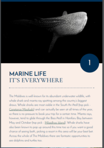
Credit: Experience Travel Group
A stunning, large image, a big clear headline, and contrasting text with visible links. Nice.
And here’s an example of an, er, not-so-good one
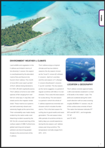
Credit: Visit Maldives
Looots of uninterrupted text, three thin columns, and a very small image. Room to improve.
We’ve got loads more great advice on how you can better engage with your clients between booking and boarding. In fact, we got so much that we put it all into one guide. You can download it for FREE here. If you’d rather jump in and get a feel for Vamoos yourself, you can start a free trial in seconds.